Art & Decor Trends
The Top Pantone Colors of 2014 In Art Masterpieces
There is no better time to dream in colors than when the sunlight is back in the sky. And no better advice to follow than the one coming from Pantone, the international leader in color technology and trends from design to decoration.
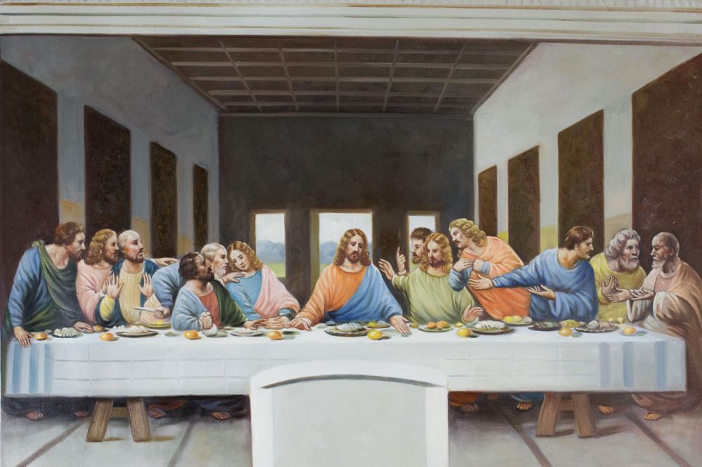
 When we dare to match tendencies with timeless art, what were beautiful tones turn into true statements of elegance, beauty, and meaning? And if the originals are too much of a dream for your wallet, we selected beautiful handmade reproductions at overstockart.com so that you can transform your walls into masterpieces.
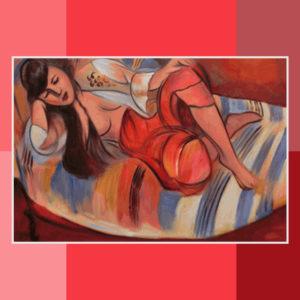
Cayenne (P18-1651)
A high impact color, spicy and hot, that mixes to perfection the romance of strong pink with a hint of a Boudoir feeling. It looks enigmatic with blue and witty with freesia. It inspires confidence, passion, and a zest for life, and it goes beautifully with “Odalisque” by Matisse.
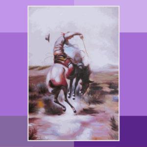 Violet Tulip (P16-3823)
It is commonly related to creativity, individualism, and rebirth – which goes well with the theme of spring. It can be combined with orange to yellow hues for an extravagant effect, or with white and neutrals for a romantic atmosphere. For a balanced combination “A Slick Rider” by Charles Marion Russell is a great choice.
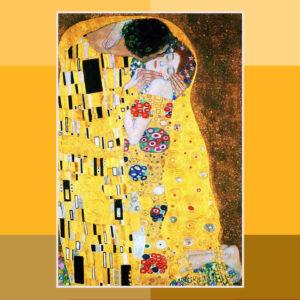 Freesia (P14-0852)
It brings powerful and floral energy. From all the trends, yellow is the hottest statement for those who dare to use it right. It is the tone of happiness, intellect, and energy and it says sunshine as no other. What better way is there to play with this color than “The Kiss” by Gustav Klimt – the master of bold and golden colors.
Dazzling Blue (P18-3949)
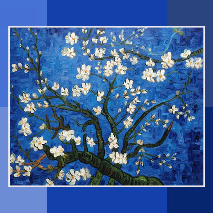 It is the most popular trend among stylists and designers, either combined with aquatic color for a summery feeling, or with warm reds and cayenne for a bold statement. It is a deep, stable color, symbolizing trust, loyalty, and wisdom, beautifully mastered by Van Gogh in his “Branches Of An Almond Tree In Blossom”.
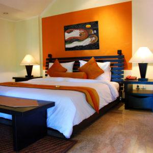
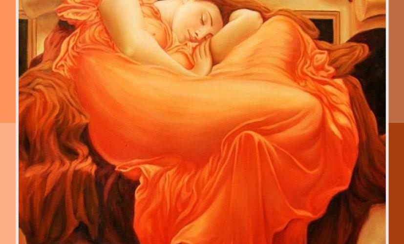
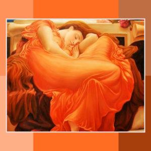 Celosia Orange (P17-1360)
One of the most seen from interior designs to catwalks and it has been referred to as the new black for this year. It is a hot color, full of pleasure and enthusiasm, as it represents attraction, strength, and success. If the orange tones are your choice for this season, “Flaming June” by Leighton is a beautiful way to celebrate it.
Placid Blue (P15-3920)
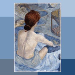 The tranquility tone of the year, bringing a sea breeze to feel with it. It can be brightened up by dazzling blue tones, or played with soft mint, coral tones, and silver grays for the perfect balance between confidence and playfulness. Light blues are related to softness, healing, and understanding. Make it deeper with a Toulouse Lautrec like the “Woman at Her Toil“.
Paloma (P16-0000)
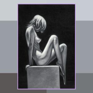 It is solid, stable, and perfect to match with the strong colors of the season. It gives the stability of a neutral tone with a very distinct edge. It represents elegance and compromise; ranging from the more mysterious personalities the closer it is to black, to the more lively as it gets closer to white and silver. “Posture of Thought” is perfect to compliment the theme.
Sand (P15-1225)
 It is a neutral, calm, and relaxing tone with a hint of warmth. A very flexible hue to combine with strong colors and one of the interior designers’ firm favorites for this summer. It will also be the trend for the linen lines returning this season. To bring up the elegance and simplicity it represents, give it a touch of Egon Schiele in “Mutter und Kind“.
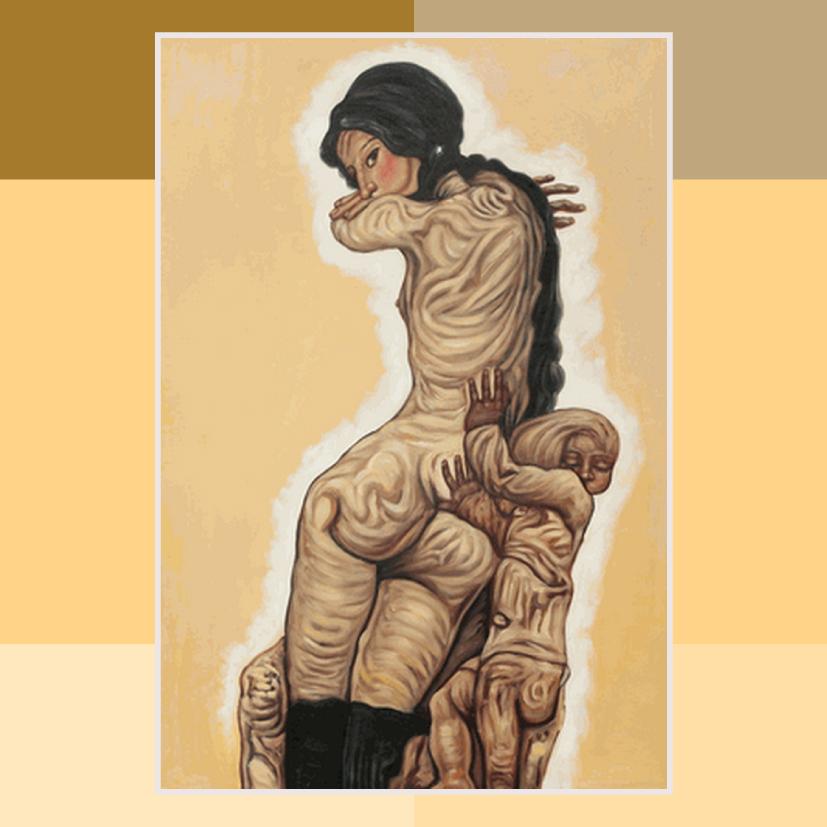
Hemlock (P15-6114)
 Perfect to match with prints or to play with black hues. If you are looking for a provocative twist match it with Cayenne, if you are in a ‘signature look’ mood combine it with Violet Tulip. This color is associated with growth, harmony, and the right balance between head and heart. To give an edge, use it as a background for the strong Wierzbicki piece, “Awakening”.
Radiant Orchid (P 18-3224)
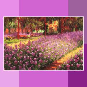 Last but not the least, this is the color crowned by Pantone as the queen in 2014. This vibrant tone brings the energy of reds and the stability of blue. It is often associated with royalty as it symbolizes luxury and ambition. To make the most of it combine it with Monet’s “Garden at Giverny”.
About the Author Teresa Filipe Lopes
Teresa is a writer with a twist of design and art. She is addicted to dancing, laughter, cherries and random words in cool typography. Plans to fly, run on water, find a dragon and sleep with tigers before she dies. And change the world, of course.