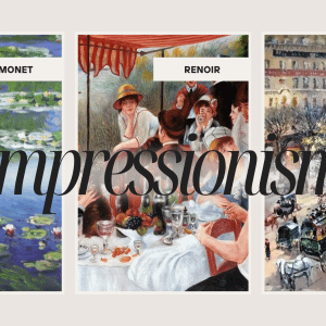
Art & Decor Trends
Choose Wall Paint Colors Based on Fine Art
Redecorating a home can be challenging and picking out a new color scheme may seem like the most daunting part of the process. Reds, blues and greens are all viable options, but which shade? What about the trim? Then begins the frenzy of online searches, torn out pages from magazines, and stealthily analyzing the homes of friends and family for inspiration.
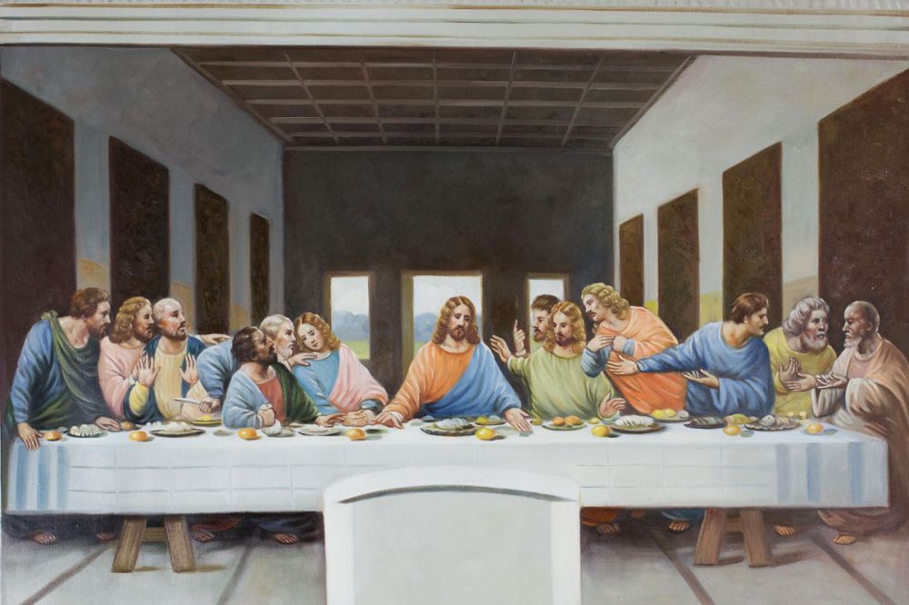
After the headache of choosing colors and painting the walls, another challenge arises: What to decorate the walls with? Let’s start with that question. Choose a work of art to inspire your color scheme and forget the online searches for “wall colors ideas.” When you go to peruse the paint chips in the home depot store, you will be prepared. Here are three examples from the reproduction art galleries of Overstock Art to inspire you as you choose home wall colors. Click on the hyperlink art titles to have the ability to zoom on each painting as if it were inches from your eye.
- Klimt’s The Kiss
Gustav Klimt’s The Kiss (1907-08) is an iconic painting of two lovers sharing a romantic kiss among a bed of flowers. Which colors appear the most vibrant to you? Where is your eye immediately drawn toward? Now, imagine if you chose the same color to paint the walls with. Perhaps it is the brightest yellow that you are drawn toward. If you painted the walls with this color, the painting and the wall color would appear to vibrate as if you were staring at the sun. It would be advisable to select a color a shade slightly different than the most vibrant color. The most vibrant color or colors could be chosen as an accent for the trim, if selecting a slightly varied shade. A red pulled from the painting could be a possible choice as it is less used in the composition but would make the painting also stand out.
- Renoir’s Near the Lake
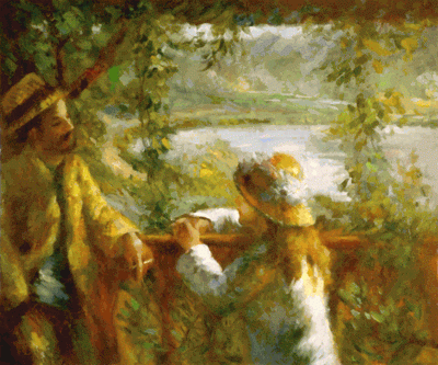 Piere-Auguste Renoir’s Near the Lake (1880) marks transition from the artist’s painting in the style of Impressionism and a return to Classicism. The color palette here is warm. Soft country yellows or sage greens can be pulled. Choose colors that remind you of a sunset. Perhaps the room you are painting receives light from a beautiful sunset. If you prefer a less warm palette but still love this painting, take inspiration from the sea and the mountains in the distance, the clothing the young woman is wearing, and choose a blue-grey.
- Sisley’s The Church at Moret in Morning Sun
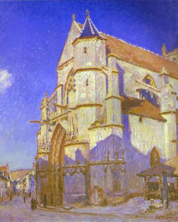
Alfred Sisley The Church at Moret in Morning (1893) painted fourteen variations of Eglise Notre-Dame at Moret from a southwest direction. In his time, the artist became acquainted with Monet and Renoir. Here the color palette is cool. A rustic yellow ochre can be chosen and the blue color has associations soothing and relaxation as the vibrant painting, while the yellow ochre would have an inviting warmth. Choosing a blue from this painting is also a viable choice; notice an almost indigo color that can be used as a possible trim or accent.
Keep in mind a few tips. Remember to not match a warm and cool color together as predominant colors. Choose one color as your predominant color, and then use other colors as accents. Bright, vibrant colors add visual weight, such as a vibrant yellow which can mimic the effect of staring at the sun; this effect of visual weight can also appear to retract a room or make the room seem to expand. Sometimes a nice, deep red in a small room can make it seem lively and intimate, depending upon your taste. Warm and cool colors can even affect our perception of the temperature in a room.
These paintings by Klimt, Renoir and Sisley are only suggestions to get you started on choosing the best wall colors. Perhaps consider color schemes throughout your home from art styles, such as Impressionism or Traditional. The possibilities are limitless. Your friends and family are sure to envy your inspired idea for home wall colors based on fine art.
About the Author Tiffany Chaney
Tiffany Chaney is a freelance writer, artist and graphic designer residing in North Carolina. In 2012, her first poetry collection Between Blue and Grey was released. Find out more about her at www.tiffanychaney.com.