Art & Decor Trends
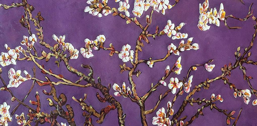
Pantone Color of the Year 2018: Ultra Violet
This year Pantone decided to move away from the “safe” colors of years past and choose something unexpected, Ultra Violet. As described by the Pantone website “Ultra Violet, or Pantone 18-3838, is a complex, celestial shade of purple, veering toward the cooler end of the color spectrum. “ It brings to mind the swirling colors of far off galaxies and deeper shades of space. It is also inspired by the mystical quality most associate with a rich and luxurious blue toned purple. Purple often symbolizes royalty or wealth and can be considered a color of high status. This is meant to be an evocative color that stimulates the mind and invokes deeper meditation.
The people who picked this color felt that it was needed in a time when there is so much turmoil in the world. They wanted something that would encourage new thinking and ambition for the future. This is the color of the galaxy, which has endless possibilities and mysteries to discover. It was a popular color with many visionaries including Jimi Hendrix, Andy Warhol and Frank Lloyd Wright. People associate it with creativity and ingenuity throughout history.
Use of this kind of color in home décor invites people to feel cool and more introspective. It can be used in smaller doses with art or accessories, but also makes a dramatic statement when chosen for furniture or accent walls. It pairs very well with other bright colors like last year’s Greenery, or as a contrast to cool toned neutrals. Metallic colors, like copper can really pop when combined with the intensity of Ultra Violet. Perhaps you can start with a piece of art to introduce the color into a room and capture the inventive mood this color is meant to inspire.
About the Author Amanda Hadley
Amanda graduated from the University of Kansas, where she studied English literature and got a masters degree in library sciences. She enjoys reading, cooking and playing with her nephews. Her best friend is her little dog Brady.