Art & Decor Trends
Pantone Announces 2016 Color of the Year
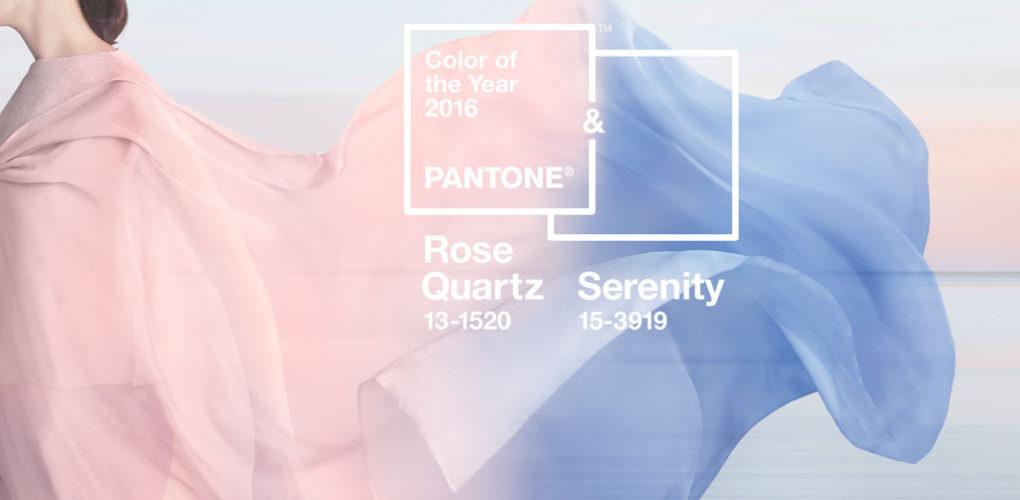
Pantone’s color of the year 2016 is here! In a surprising twist, the ‘color’ of the year is actually two hues. For the first time, Pantone has chosen to blend two colors into one forerunner. Both calm colors and both gentle, Rose Quartz and Serenity are the chosen ‘it’ for the upcoming year.

With its warm pink tones Rose Quartz is composed, feminine and soothingly sweet. Serenity, a subtle blue shade, evokes light and airy feelings – causing pause for relaxation. Combined, the two connect the masculine and the feminine while inspiring true tranquility.
Why two colors for 2016? Pantone chooses its color of the year based on societal trends. Looking at our culture, the color of the year reflects the current mood. The melding of two hues stems from a move towards gender equality and the use of color as a form of expression that has become unhinged from traditional meanings. With a freeing of the mind, the dual color selection shows the world that there is no longer a defined masculine and feminine – but instead an open fluidity of the two.
Along with blurring gender expectations (when it comes to the symbolic use of color), Rose Quartz and Serenity evoke a sense of calm and peacefulness that is necessary during turbulent time periods. The color combination softens the harsh world and creates a sense of peace and calm.
Are you looking to add Pantone’s choices to your home décor, but aren’t exactly ready to re-paint every wall with the pink and blue tones? Start with a few subtle accents. A simple solution is to incorporate the colors through artwork. Edward Henry Potthast’s At the Seashore is certainly a serene scene. With gentle ocean waves and a vacation vibe, the artist’s use of the Rose Quartz and Serenity shades gives the impression of a sunny summer day.
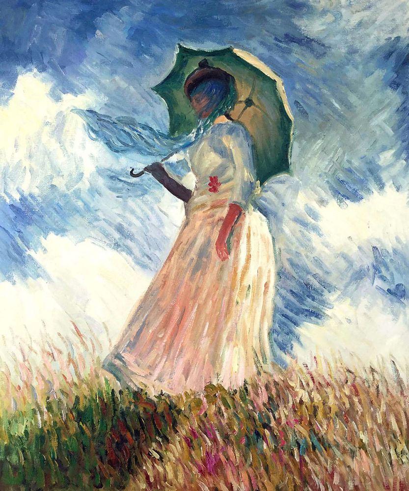
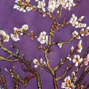
Also filled with warmth and light, Claude Monet’s Woman with a Parasol takes the colors of the year and melds them into a natural, airy setting. The serene blue sky and the rose tones pair in this famed piece. The muted colors of Van Gogh’s Blossoming Almond Branch in a Glass with a Book bring peace and calm as well. Between the blue-drenched background and the rose touches, the painting pairs the colors in a subtle yet striking way.
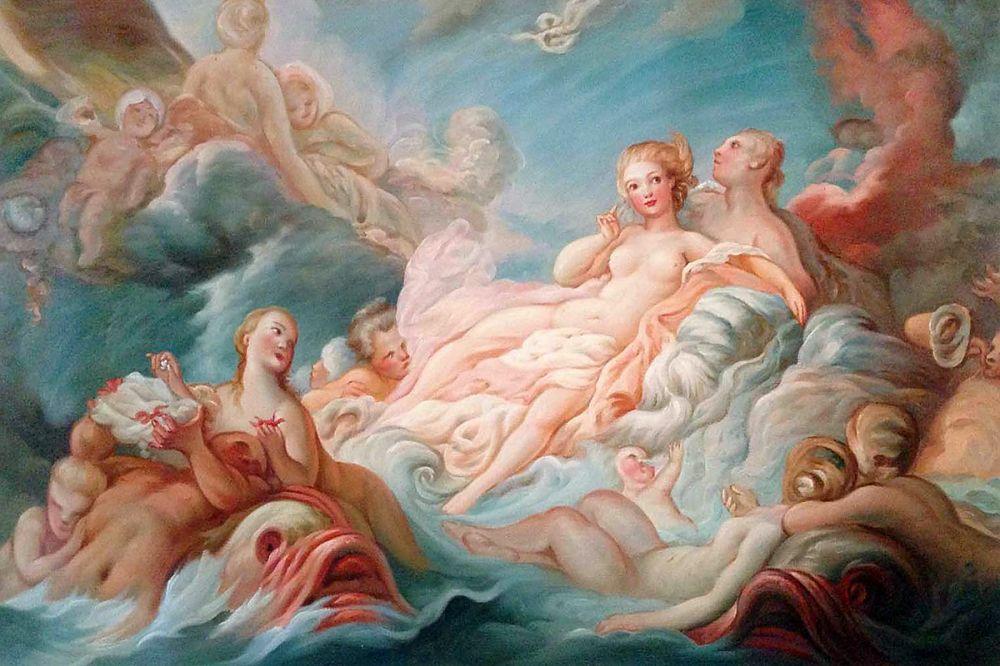
If you’re looking to go entirely serene, Jean Fragonard’s The Birth of Venus takes the tones to an almost heavenly elevation. The mixture of the colors set against the sky soak this work with warmth, calmness and relaxation.
While these works highlight Pantone’s choices, they are far from the only pieces of art that bring Rose Quartz and Serenity together. Take a look at our 2016 Color of the Year Pinterest board for an array of artistic options!
About the Author Erica Loop
Erica Loop has a BA in the history of art and architecture as well as film studies. She has worked for the Andy Warhol Museum and the Carnegie Museum of Art. Ms. Loop has taught studio-based art classes for children from toddlers to teens for the past decade along with writing freelance content across the web.